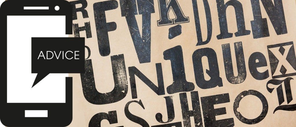
It’s often said that you can tell a lot about someone by their handwriting. Whether they are a calm, methodical person, or assertive and confident; whether they are a nervous retiring sort, or a gibbering loon. It’s called graphology. Apply this theory to choosing a font (typeface) for your company branding – what does it say about you? Here are a few thoughts based on this theory. Call it fontology, if you like.
Helvetica – Global superstar. It’s everywhere – strong and dependable. Portraying passion to daintiness.
Gill Sans – Very British. Proud and practical. From the BBC to the Church of England, Penguin Books to British Rail. Service to industry.
Garamond – An old faithful. Elegant, classic and highly legible. Influential yet warm.
Zapfino – Very effective calligraphic style. Use sparingly. Don’t write letters in it!
Times – Old school, corporate, trustworthy. Is it a bit dull and over used?
Frutiger – A good communicator. Used across the world in airports. Get’s you where you want to be.
Cooper Black – The Beach Boys to Easy Jet. Impactful, friendly and fun. Looks good from a distance. The bigger the better.
Optima – Beautifully subtle. Makes fabulous headlines and legible copy. German modernism, used by the French on football shirts and Yves Saint Laurent.
Rockwell – Geometric slab serif. Strong, powerful and solid. Don’t think westerns. Think individual and thoughtful.
Gotham – A new comer and all rounder. Designed for GQ magazine and used by Obama. Solid, forward thinking and flexible.
Bodoni – Distinctive. Sophisticated. Classy. Used by Vogue. Don’t use for text. Use it to make a statement.
Comic Sans – Doesn’t make you a comedy genius!
Your logo is often the first thing people see of your company and we all know first impressions last. So it does take some thought to get it right. As branding specialists we can help you make that first impression count. Are you a flexible Gotham, a subtle Optima or a proud and practical Gill Sans?
Our logo? We’re Helvetica…
More Stories
The Creation ADM Guide to Zoom Etiquette
Ever since we all started working from home, Zoom seems to have taken over the world. And as it’s risen to prominence, we’ve seen video…
The Power of LinkedIn for Businesses
LinkedIn is the largest professional social network in the world, with more than 500 million users. But many businesses aren’t taking full advantage of the…
Just Launched: A Better Planet
Introducing “A Better Planet” – an exciting new initiative, powered by Creation ADM. Following on from the (almost-award-winning) work we recently undertook to support the…


