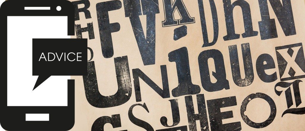
It’s often said that you can tell a lot about someone by their handwriting. Whether they are a calm, methodical person, or assertive and confident; whether they are a nervous retiring sort, or a gibbering loon. It’s called graphology. Apply this theory to choosing a font (typeface) for your company branding – what does it say about you? Here are a few thoughts based on this theory. Call it fontology, if you like.
Helvetica – Global superstar. It’s everywhere – strong and dependable. Portraying passion to daintiness.
Gill Sans – Very British. Proud and practical. From the BBC to the Church of England, Penguin Books to British Rail. Service to industry.
Garamond – An old faithful. Elegant, classic and highly legible. Influential yet warm.
Zapfino – Very effective calligraphic style. Use sparingly. Don’t write letters in it!
Times – Old school, corporate, trustworthy. Is it a bit dull and over used?
Frutiger – A good communicator. Used across the world in airports. Get’s you where you want to be.
Cooper Black – The Beach Boys to Easy Jet. Impactful, friendly and fun. Looks good from a distance. The bigger the better.
Optima – Beautifully subtle. Makes fabulous headlines and legible copy. German modernism, used by the French on football shirts and Yves Saint Laurent.
Rockwell – Geometric slab serif. Strong, powerful and solid. Don’t think westerns. Think individual and thoughtful.
Gotham – A new comer and all rounder. Designed for GQ magazine and used by Obama. Solid, forward thinking and flexible.
Bodoni – Distinctive. Sophisticated. Classy. Used by Vogue. Don’t use for text. Use it to make a statement.
Comic Sans – Doesn’t make you a comedy genius!
Your logo is often the first thing people see of your company and we all know first impressions last. So it does take some thought to get it right. As branding specialists we can help you make that first impression count. Are you a flexible Gotham, a subtle Optima or a proud and practical Gill Sans?
Our logo? We’re Helvetica…
More Stories
Why go mobile?
Mobile computing is more widespread than ever, yet few people recognise its potential. Even the web giant that is Facebook has recently been accused of…
Creation unveils new website for flooring specialist
We are delighted to have been chosen to design and build a new website for Branagan Flooring Services, www.branaganflooringltd.co.uk. The site is already generating new business for…
Future Proofing Your Business
What lessons can we learn from Britain’s failing High Street? And what business marketing strategies can help? In recent months, the decline of well-known high…


