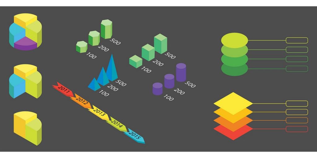
Adding infographics to your blog posts and social media channels is a great way to engage with your target audience. They allow you to demonstrate your company’s expertise in a specific field, grab the attention of potential customers and they may even go viral, which is great for brand identity, as well as SEO (think of the potential for backlinks).
But how do you go about creating a great infographic? We’ve compiled some top tips below that should hopefully set you on the right path.
Before You Start
Before you begin creating, take some time to think about who your target audience is and what you want to tell them. Infographics might be a fantastic way to condense lots of information into a highly visual and compelling format, but if it isn’t relevant and personalised to your audience, you’ll be wasting your time. For more information on defining your audience, read our blog post.
Typography
Whilst text should never be the dominant element in your infographic, you’re still probably going to need at least some, for example to provide some extra context for your data. To keep your infographic simple and easy to read, limit yourself to just two or three fonts. We recommend choosing one style for your headings and another for the main body copy. Try to avoid using ornate or decorative fonts; If you feel the design would benefit from one, use it sparingly. When choosing fonts, remember that some go together better than others. There are lots of sites online that’ll help with picking some out which are complementary. Finally, you should only really have three font sizes. Your headline should be the biggest, followed by your subheadings and then everything else. This will keep your design consistent and make it feel less cluttered. Make sure that your smallest font is readable even on the smallest mobile screens and that when your infographic is shrunk down on a web page the text is still legible.
Colours
Whether it’s your text, graphics or background, the other thing you need to keep consistent is your colour palette. Again, keep things simple and choose a limited number of complementary colours – but don’t just use one, as your infographic will be dull and uninspiring. Using your own brand colours is a great idea, but if you want to use some others, opt for neutral, lighter hues in a business context, or brighter, bolder colours if you’d like to have a bit more fun with your design. You may also want to highlight particularly important pieces of information with a contrasting colour, but avoid bright neon colours as they can be a strain to read on a webpage.
Headlines
The aim of your headline should be to grab a reader’s attention and encourage them to read the rest of the information you present. Keep it short and snappy; it should be long enough to describe the content but short enough to be understood quickly. You may benefit from using a subheading to give a little more information.
Data
One of the most common uses of infographics is to display data in an easy to digest manner. There are a number of different ways you can choose to display this data, with some of the most common including pie charts, bar charts and line graphs, as well as proportional graphics. Try to use a variety of data visualisations for different data sets to keep the infographic interesting. Whichever option you choose, the data should be understandable within a matter of seconds. Readers look to your infographics for an easy breakdown of information, not to spend time trying to figure out what you’re trying to tell them.
Sources
But where are you going to get this data from? You could either carry out research yourself or use someone else’s, as long as it isn’t out of date. If you opt for the latter, take extra care checking that the source is reputable. You don’t want to be caught accidentally spreading misinformation across the web. Once you’ve checked, make sure you cite your sources. You can do this in the footer of the infographic. This will lend credibility to the information you post and prevent accusations of plagiarism. Your citations can be as simple as the web address of the page on which you found the information.
And a side note about the footer. Always include your logo there. If you post your infographic online and it goes viral, you want your great work, whether that’s your design or research, associated with your company.
Imagery
The type of graphic you use to illustrate your points should be consistent throughout. If you aren’t great at creating these yourself, there’s a wider range of both paid and free services with a selection of premade graphics you can choose from online.
Design
It’s all well and good adding snazzy graphics, data and text to your infographic, but it’s pointless if the reader doesn’t know where to look. Your design should guide them along the route you want them to take. You may do this with bold headings, numbered squares, different coloured backgrounds, arrows or connecting lines. To prevent crowding and make it easier to take in the information, make sure you leave some blank space between each element of the infographic. To make this easier, use a frame to align text with graphics. This will also allow you to add in margins around your content, keeping it boxed in and tidy.
If you intend to share your infographic on social media, remember that different channels specify different dimensions for images. You may need to create a few versions of your infographic so it looks its best on every channel.
Help with Graphic Design
Creation ADM is a marketing, branding and graphic design company in Manchester, with a highly experienced team ready to help your company stand out from the crowd and get the attention it deserves. Give us a call on 0161 236 3939 or complete our contact form to discuss your requirements.
More Stories
What Google Says About Older Websites
Google reward older domains right? Well not necessarily, listen to Google’s Matt Cutts explain why a brand new competitive domain may be overtaking yours.
What’s in a blog?
With the never ending search for better customer engagement, your blog is one of the key tools you can use to keep in touch with…
Feeling the Fury
We support the charity Men Matter, helping to raise awareness about and funds for, the fight against male cancers.


